Web Design
ETS Redesign
My Role
Research, User flows & stories, Sketching, Wireframing, Visual Design, Prototyping, Usability testing
Categories
Web Design
Overview
001
Education Testing Services (ETS) designs assessments and provide research in the education sector.
The company customizes products and services that are designed to improve teaching and learning, inform education policy, and advance the field of educational measurements. The products have created an international footprint that have brought millions of international users to the website.
The Problem
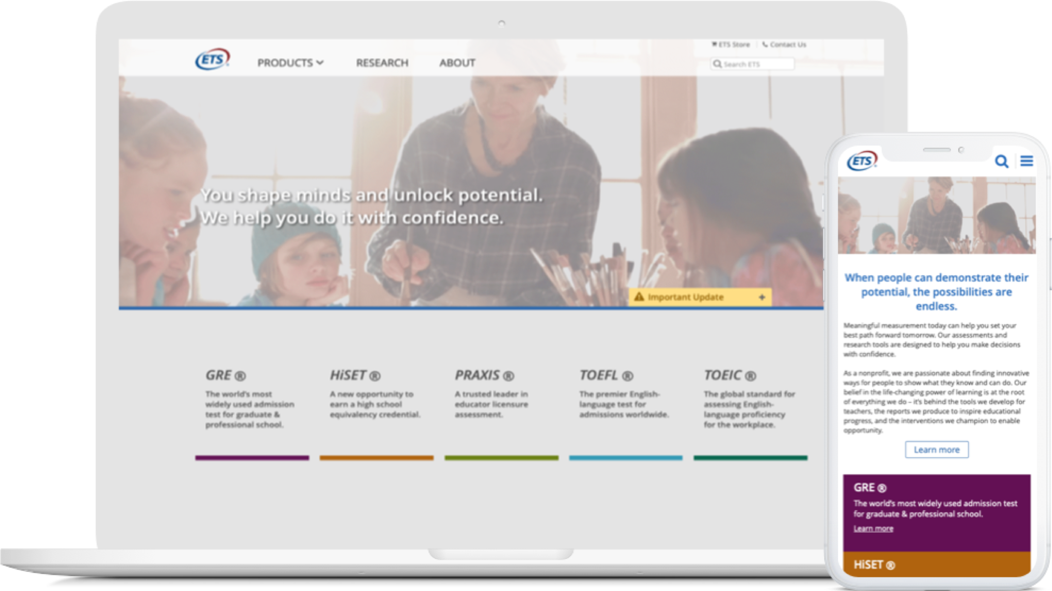
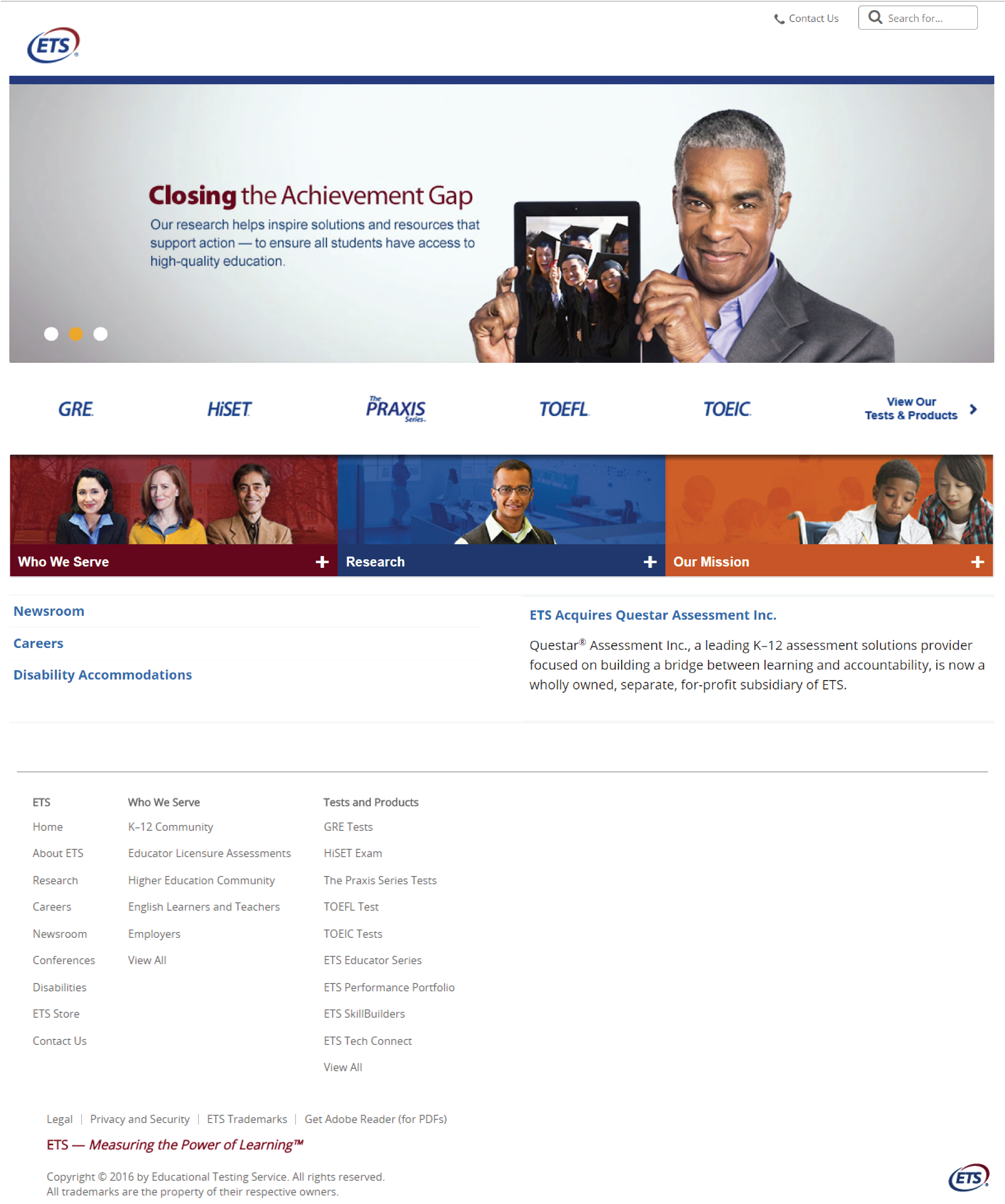
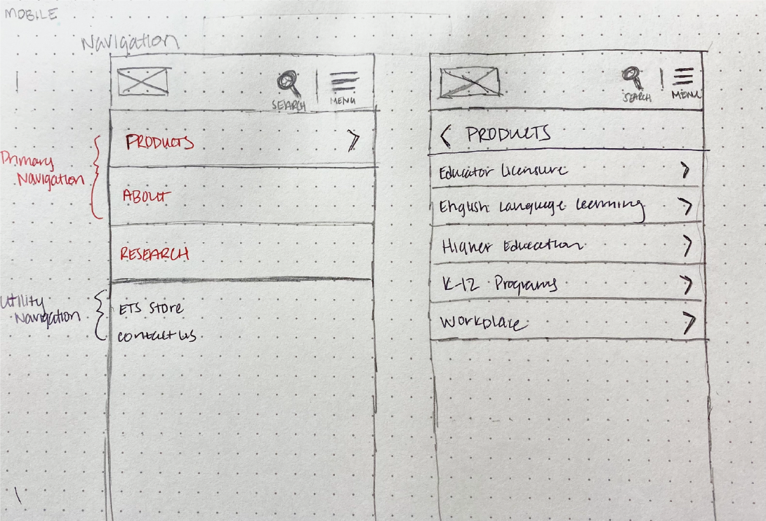
The original ETS website was causing low engagement globally and negative feedback from customers calling the call center were increasing. It was cumbersome to navigate, overloaded with content, and lack of visual hierarchy. The website was not optimized for mobile.
The Outcome
I was able to redesign the website and overcame barriers that our back-end system was lacked. By improving the navigation, and user flow, we increase optimization by 65% and calls routing to the call center decreased by 73%. This redesign set the footprint of future redesigns to come and was offered to be the lead UX designer for ets.org.
Exploring ETS.org
002
Getting Acquainted
I started this project by learning about ETS and the products and services. I had meetings with the product manager, engineers, and writers to learn the history and design decisions. We identified the current condition of the product, business goals, user needs and problems. Then I explored ETS.org myself and watched FullStory sessions to conduct a heuristic analysis. These steps helped me map out the existing user flow and site map.
UX Competitive Research
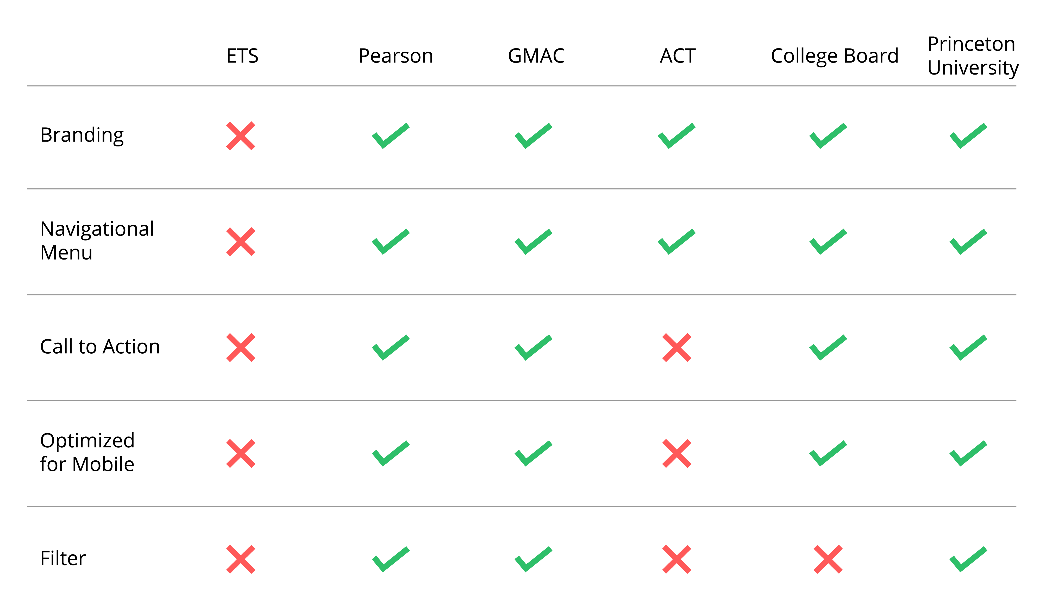
To understand various solutions and gaps in the industry, I analyzed their approaches and solutions regarding problems similar to ours’, highlighted their best practices and trends.
Checking Google Analytics
003
Finding Quantitative Data and Metrics
In order to understand how effective the current website is, I looked at both the Google Analytics and Fullstory sessions to see if there were any drop offs and where they occurred. Using google analytics I learned about the top visited pages and searches within ETS.
Testing ETS.org
004
Evaluating ETS’s current experience
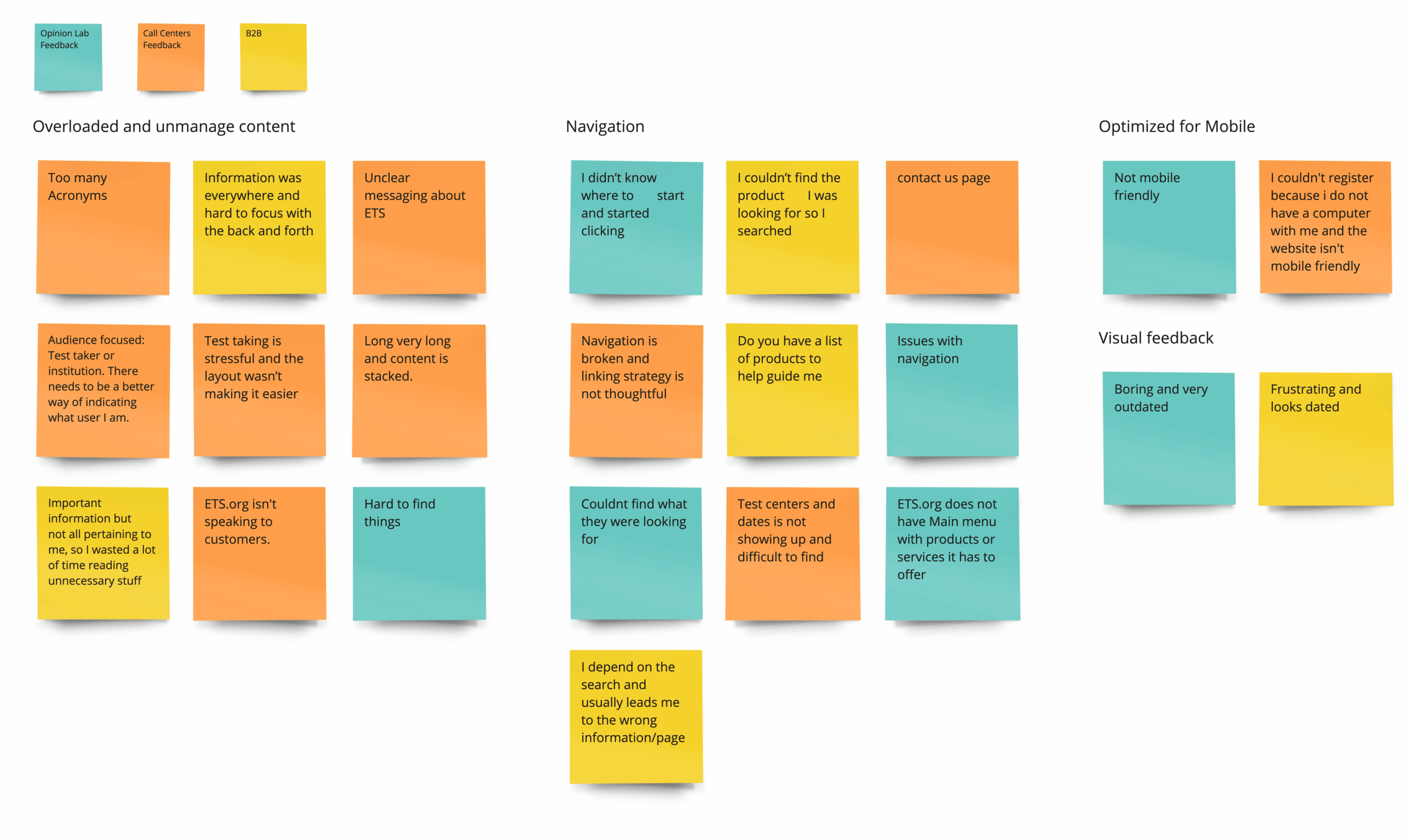
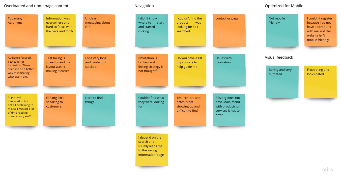
Before putting anything down on paper, I dove into current feedback that was left from opinion lab surveys, our call centers, and our field representatives (b2b). This initial set of research wasn’t to test the usability, or any new designs, but to focus on our customer’s current problems. With the collected data, I created an affinity diagram to understand how to prioritize the pain points that arose. The biggest issues ended up being:
Insights
005
Major Findings and Uncovered Insights
Based on the researched, these were the most pressing issues that need to be addressed.
Discoverability
A major issue expressed by every tester was the unclear navigation. The users felt lost, and they don’t know where to proceed. Navigation should be simple and intuitive, otherwise, there will be a continuing drop in conversions and higher bounce rates.
Overloaded and Unmanaged Pages
A few users were boggled by the long intrusive pages and had trouble finding information. The IA was not well structured and connected to other relevant content which make it difficult for users to consume information and take the next action.
How to Show Value?
Users felt that the design looks dated and boring. There were plenty of misconceptions from viewing the website on a mobile device verses a desktop. The design doesn’t align to the brand story. Users didn’t correlate the significant value of research ETS strives upon.
How can we cohesively create a clear path for users that is intuitive, easy to navigate and imparts a sense of value across all brands?
EXPLORING POSSIBILITIES
006
Ideation
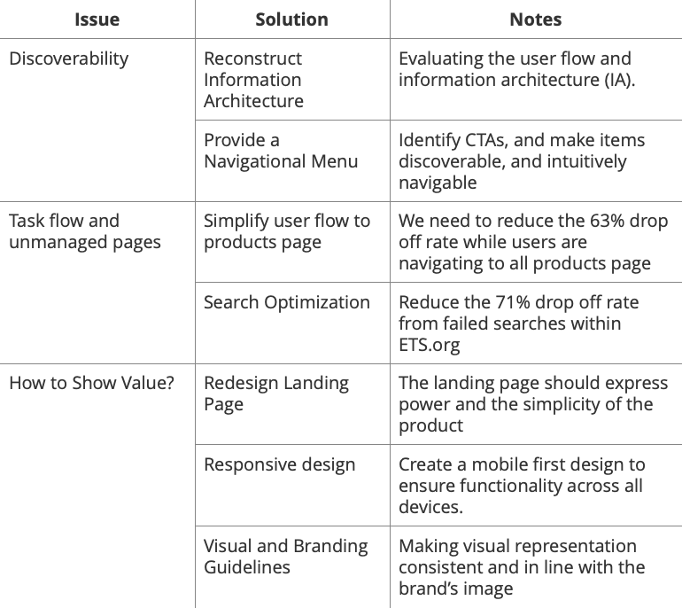
After discovering many issues during our research phase, I realized the scope of the project. By boiling down my research into these goals, it helped ensure my later design decision are grounded in my user research and actually solving the problem.
Issue #1
007
Prioritize Navigation Categories
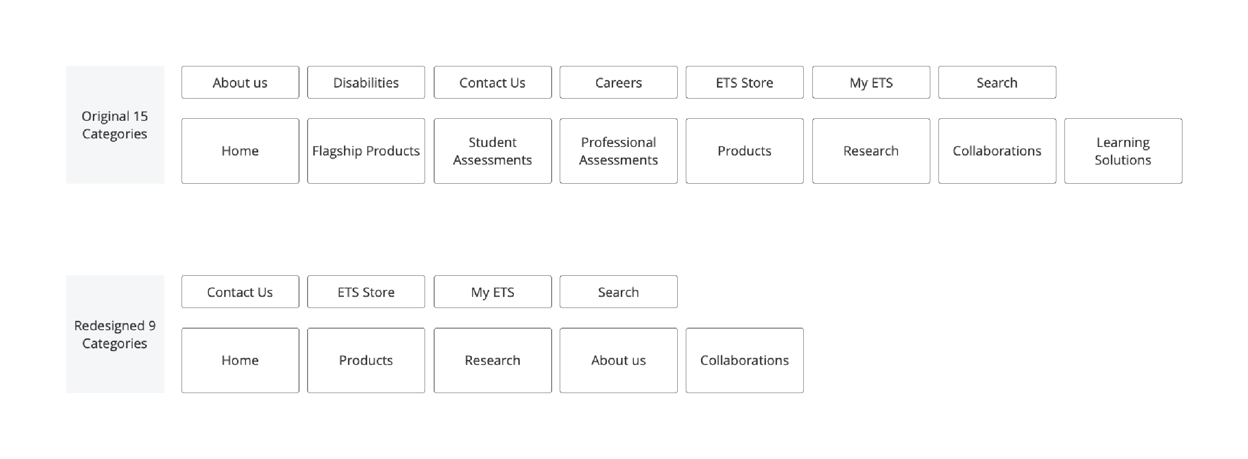
Using our core user groups, we were able to identify the navigation categories accordingly. This allowed me to prioritize the high-level categories in the menu. I performed an open card sorting test to discover how users organized ETS products and website grouping.

Issue #1
008
Navigation
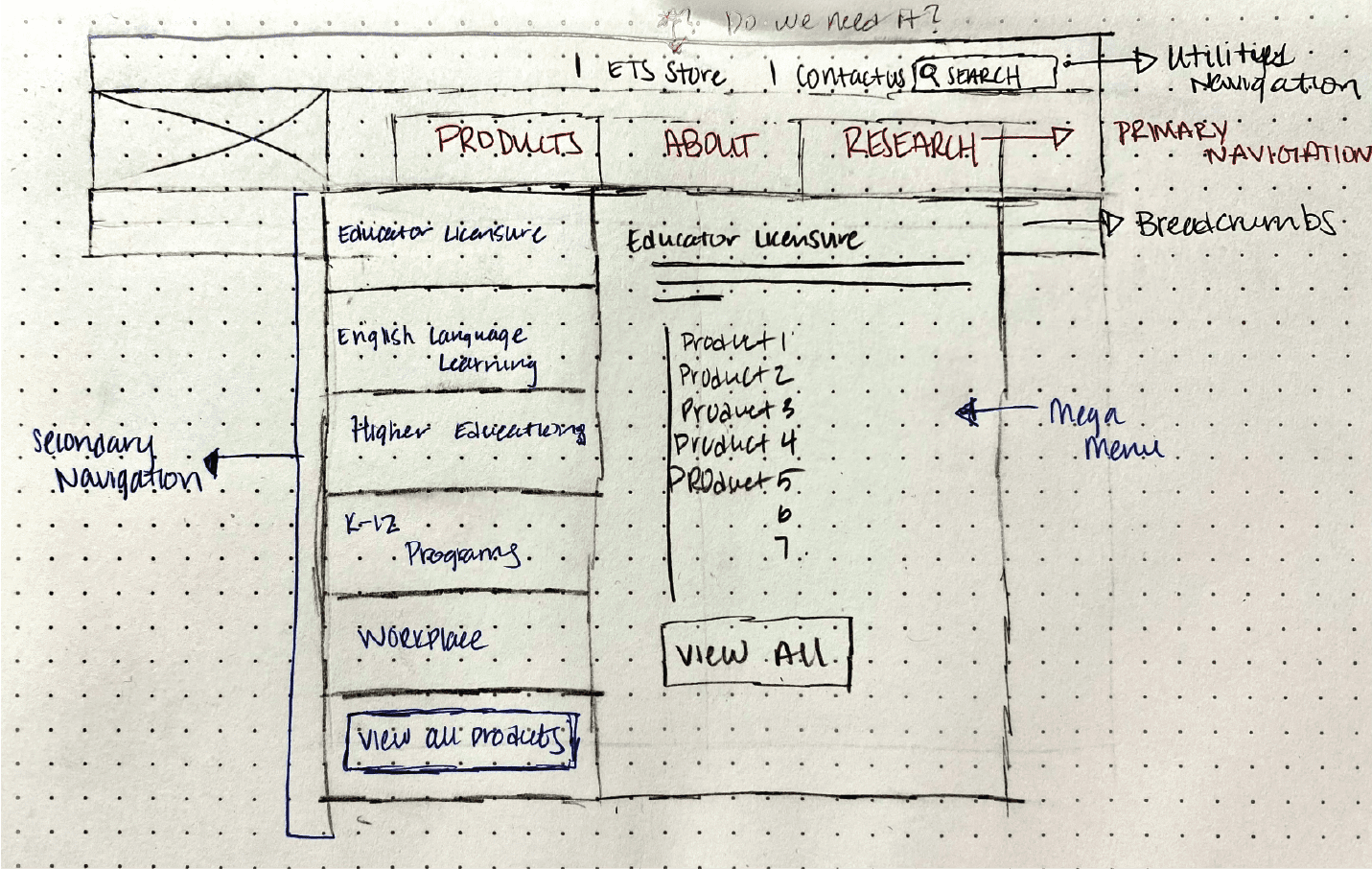
Based on users actions, we were able to prioritize primary user task with simplified taxonomy and actionable CTA’s.
Due to the scope of the project, we decided to hold off on the collaboration section for a 2.0 revision. This way the focus can be on what currently exists rather than adding an additional section.
Issue #1
009
Reconstructing the Sitemap
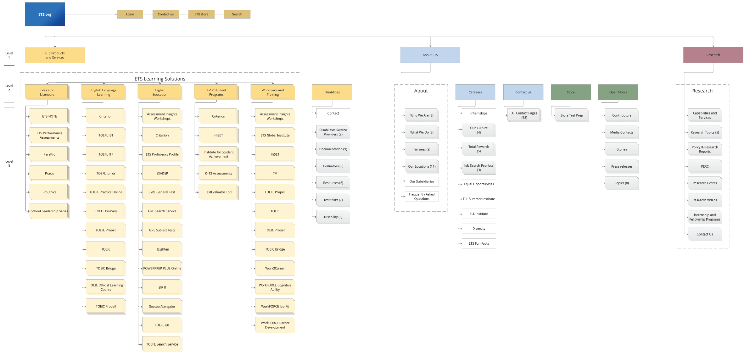
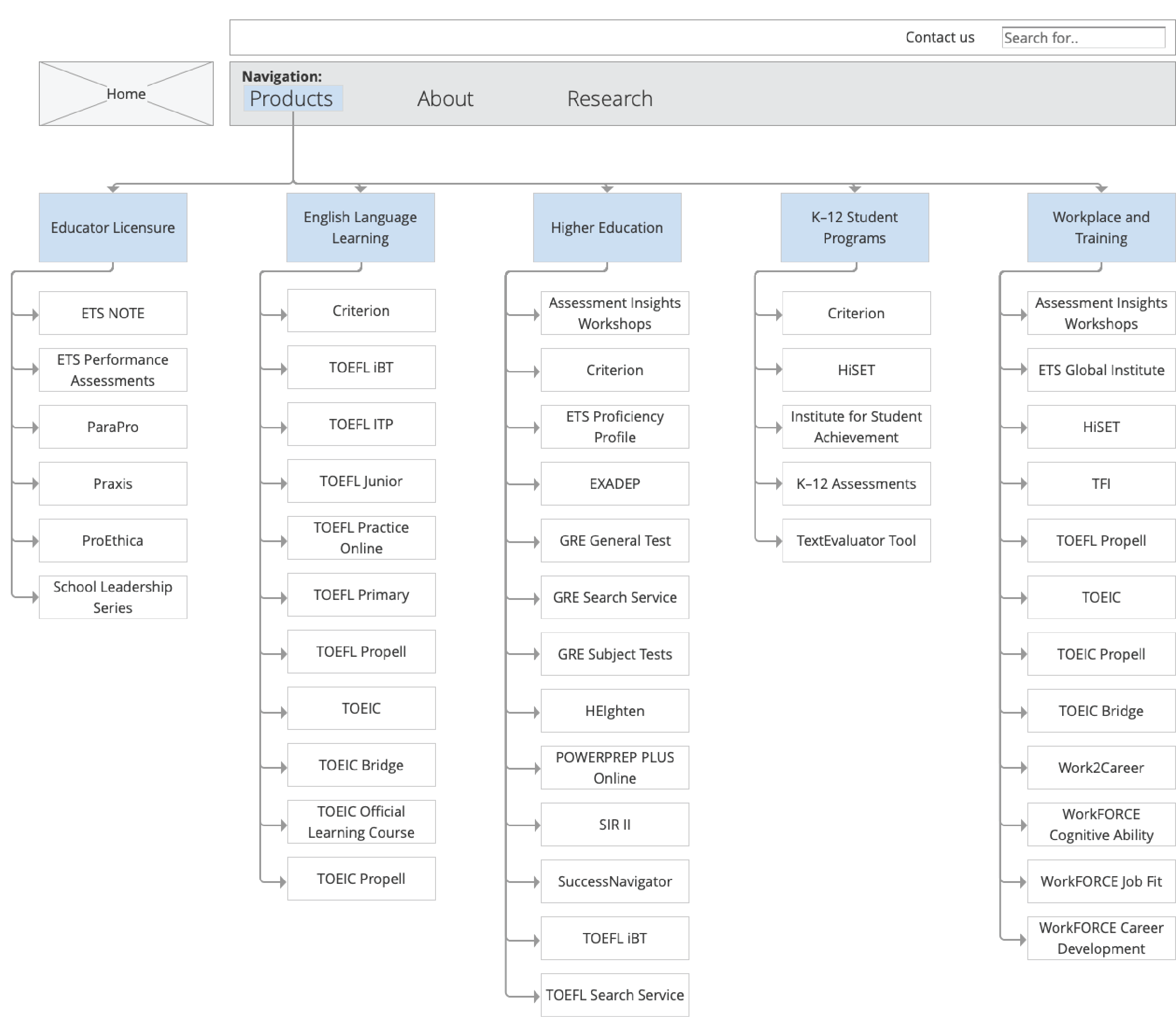
Based on the card sorting results, I made iterations to the sitemap to improve the overall information architecture to the website. We narrowed down the top level IA items from 10 to 3. The 3 main categories will help users funnel down the right hierarchy
Issue #2
010
Internal Search Optimization
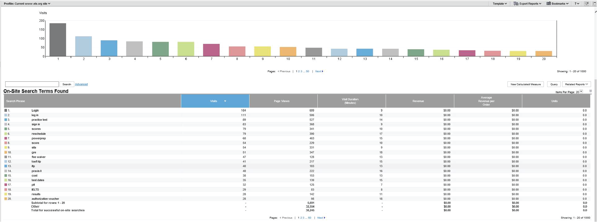
Since there was a 71% drop off rate after a user made a search, I wanted to compare the internal search data with the IA. I reviewed how customers are searching on the website and compared that to the new Information architecture. I made sure the categories matched in comparison to how users searched terms within the website.
Working With Others
011
Iterations and Collaboration
One of the challenges the team had to face was the back-and-forth communication through numerous workstreams. After everyone was on board with the new IA, I wanted to share it the development team and content writers to start updating the XML and CMS to mirror the new structure.
It was challenging on stepping outside the box of the current designs. You have to balance viability, accessibility, backend data, and a timeline.
Issue #2
012
Bringing Products to the Users
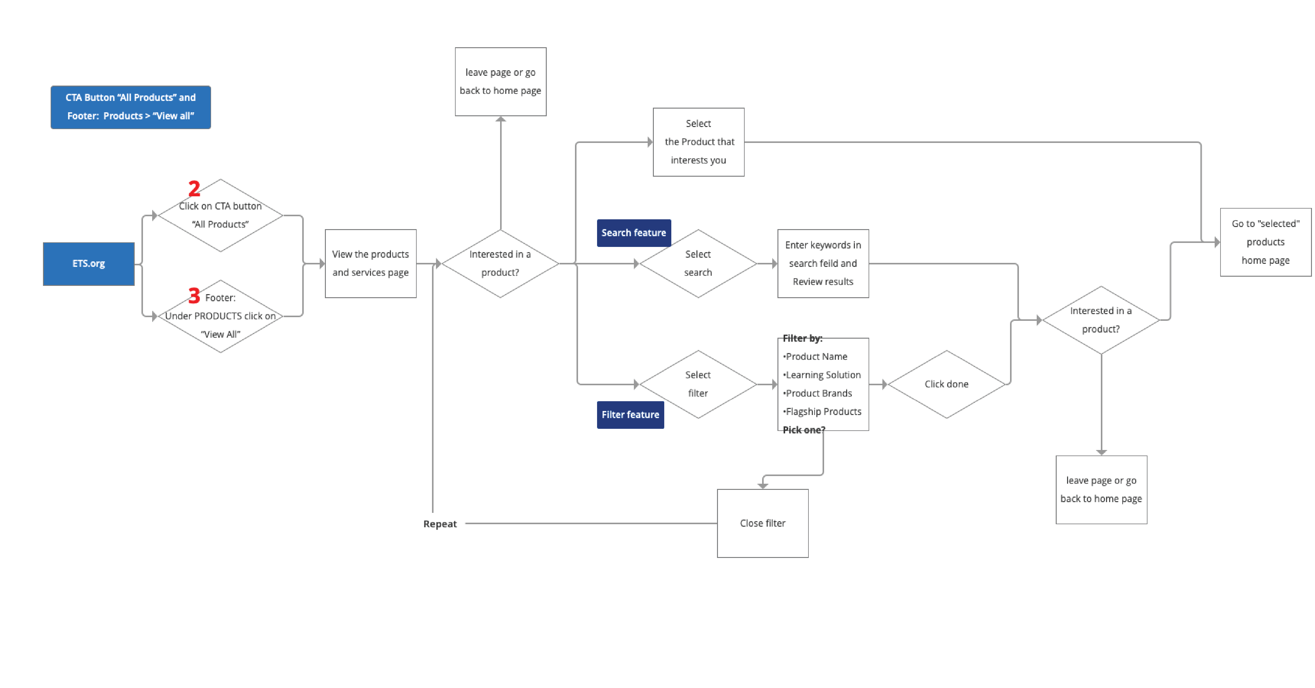
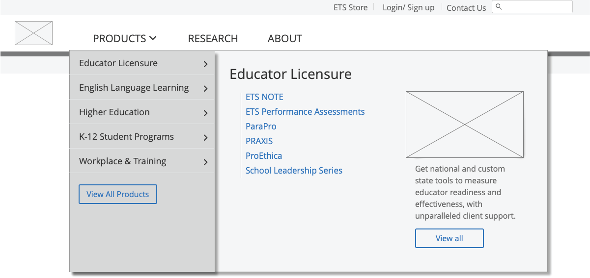
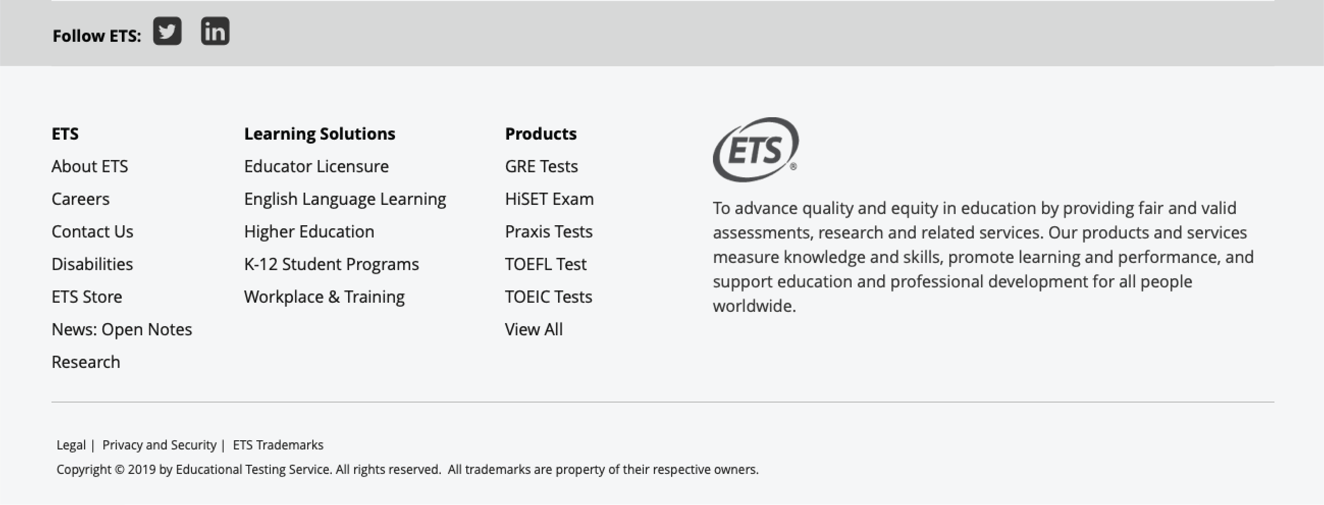
While working simultaneously on the redesign, I had to keep up with the constant changes from the stakeholders. One of the major concerns was the 63% bounce rate while the users navigated to the products page. I reduced the steps from 5 steps to 2 steps and identified 3 ways for a user to get to list of products
-
- Products menu
- All products page
- Footer

Issue #1
013
Navigation and Footer
Low fidelity
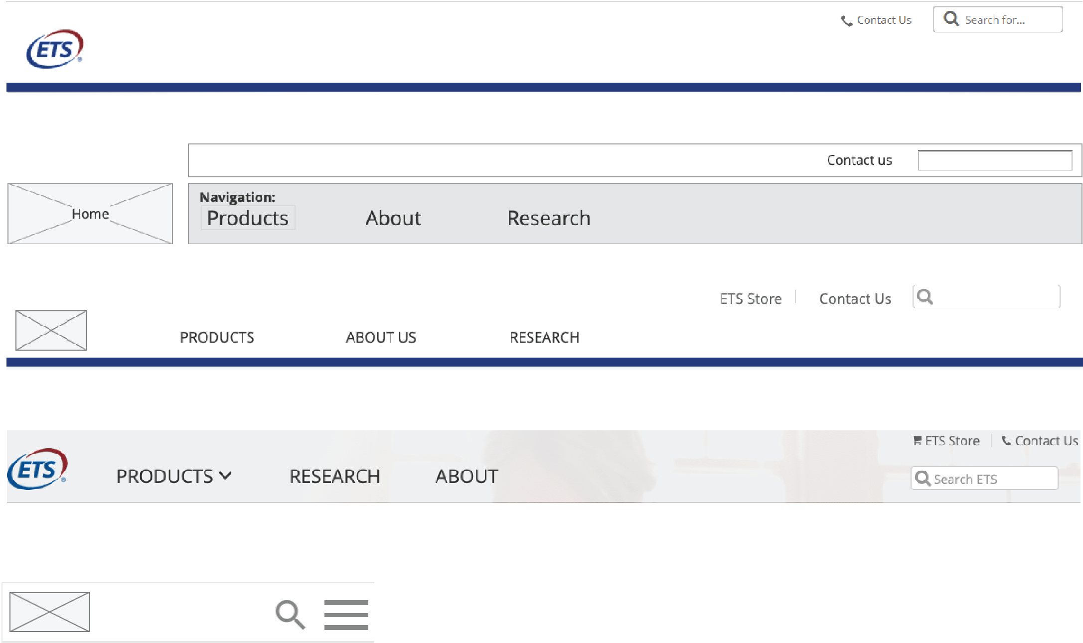
We came up with many ideas. We’d pitch them and let the others critique them. I guerilla tested the best ideas for usability.
Issue #1
014
Navigation Design
We came up with many ideas. We’d pitch them and let the others critique them. I guerilla tested the best ideas for usability. Below is our final menu and footer design. I was looking forward to see how they would do in our upcoming usability test.
Issue #3
015
Showing Value
We took the newly defined IA and sketched out screens accordingly. I went as broad as possible and sketched multiple variations for each scenarios. We then critiqued these concepts and narrowed down.
Issue #3
016
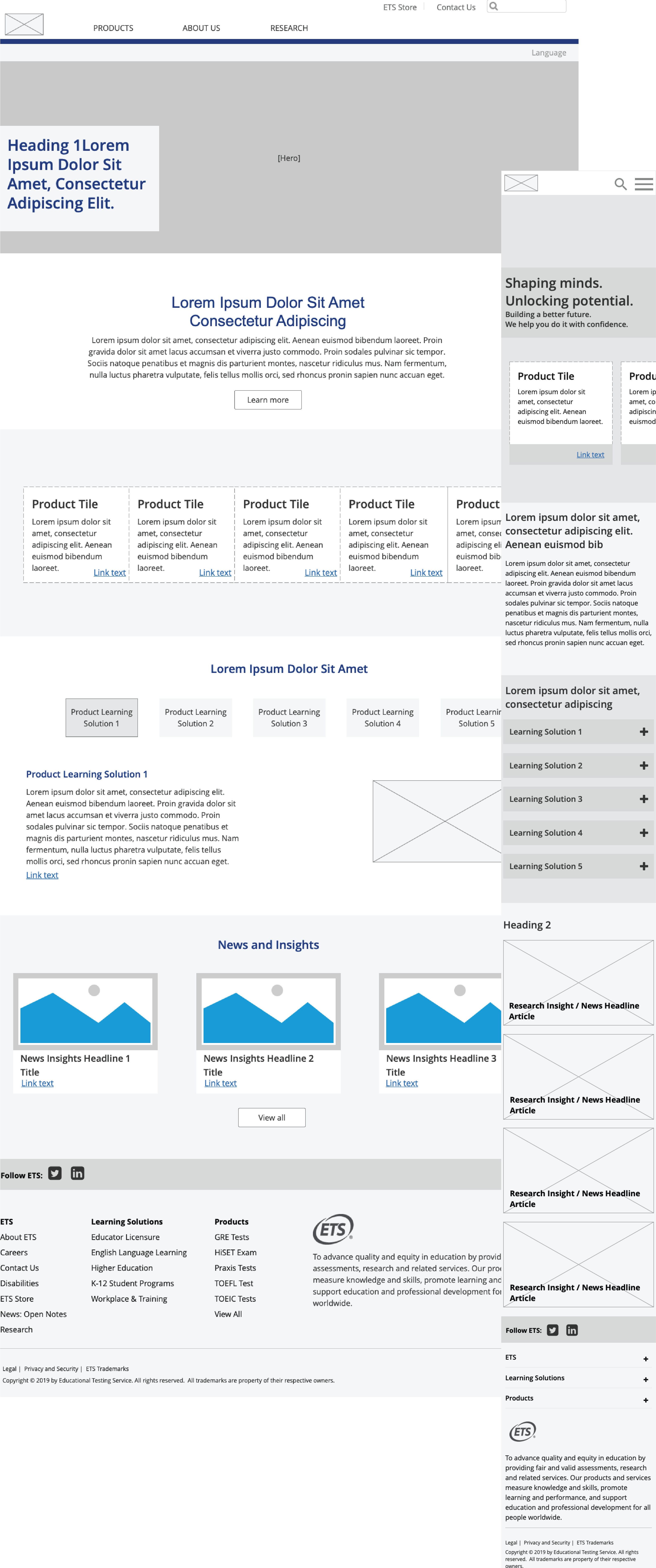
A New Landing Page
Drawing upon the valuable feedback gathered from research and testing conducted on the existing site, I embarked on a redesign endeavor for the landing page. The primary objective was to shift the focus towards the company itself, ensuring that its unique identity and value proposition were prominently showcased. To achieve this, I reimagined the layout of the landing page, incorporating visually captivating elements that would captivate and engage visitors. By infusing the design with an aesthetically pleasing and visually interesting approach, I aimed to create a landing page that would leave a lasting impression on users, effectively conveying the company’s essence and fostering a deeper connection with its audience

